Quotation Marks Store
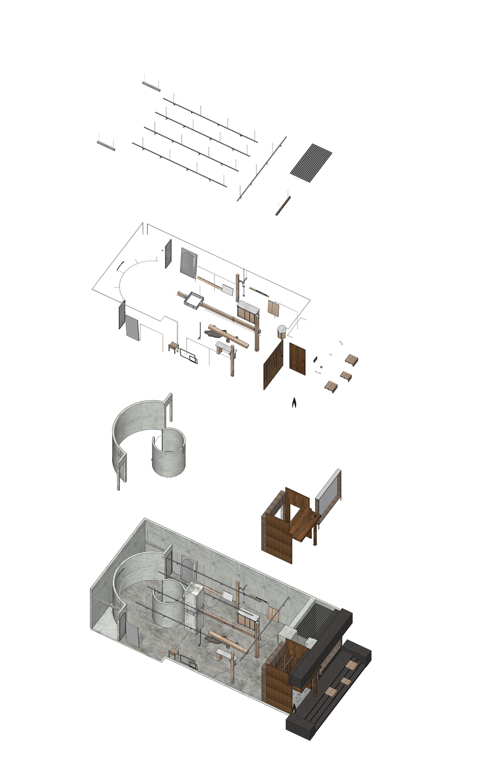
Quotation Marks' first store aims to tangibly convey the essence of experiencing a lifestyle and feeling an intrinsic spirit. It explores the spaces and clothing we can touch and feel in modern society through the interplay of nature and industry, materials and forms.
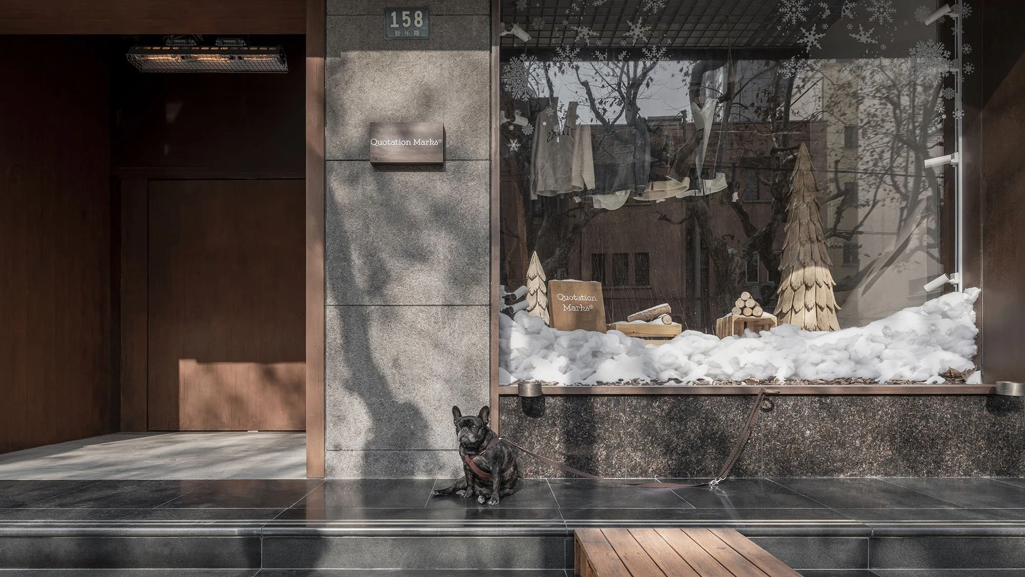
At the entrance, the designer handcrafted a mosaic of shattered cement, forming a cracked pattern on the floor. Wooden steps cleverly double as 'small tables,' reflecting the designer's creativity and humanistic care.
The creatively designed revolving door further enhances the seamless integration of the space with the external environment, naturally fostering a sense of openness and uniqueness.Here, we create an "outdoor living room" scene for the city, providing ample space and interaction opportunities for pets and their families. It's a place of inclusivity, openness, and freedom, embracing anyone and every life with open arms.
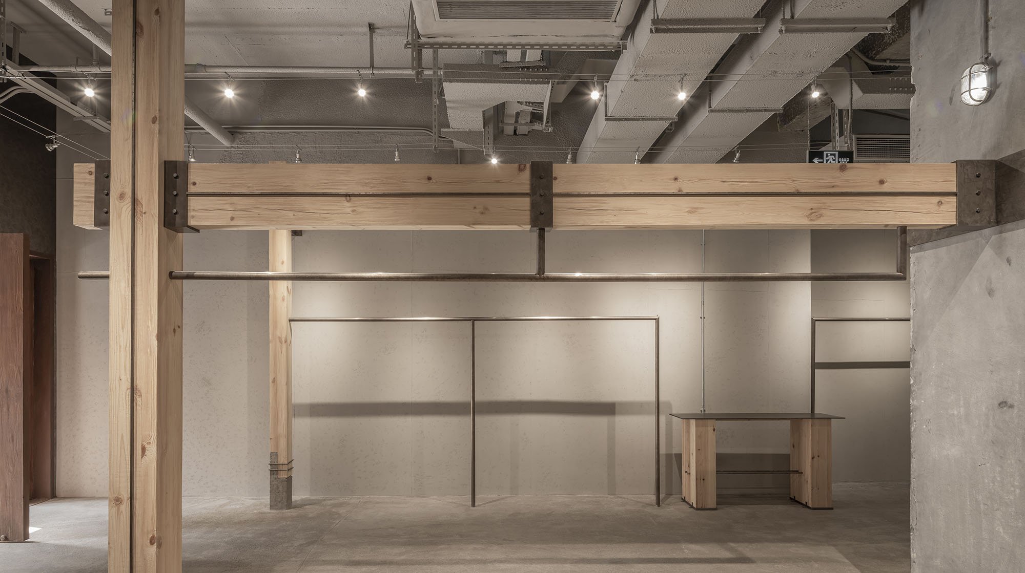
It's a welcoming space for everyone, providing a place to pause, relax, and seamlessly blend with the open environment.The space creates a rough yet minimalist aesthetic through the use of stainless steel and concrete. This is not just a choice of materials but also a presentation of artistic sensibility.The storefront embodies the Japanese industrial style, skillfully combining concrete, stainless steel, and reinforcing bars for a modern yet primal atmosphere. The addition of Japanese natural wood adds a touch of warmth, balancing delicacy with ruggedness.
The fitting room is mainly made of cement, supplemented by elevated floors and steel bars, showing the unique charm of Japanese rough modernism. It is not only a design concept but also an in-depth discussion of the fit between space aesthetics and brand.
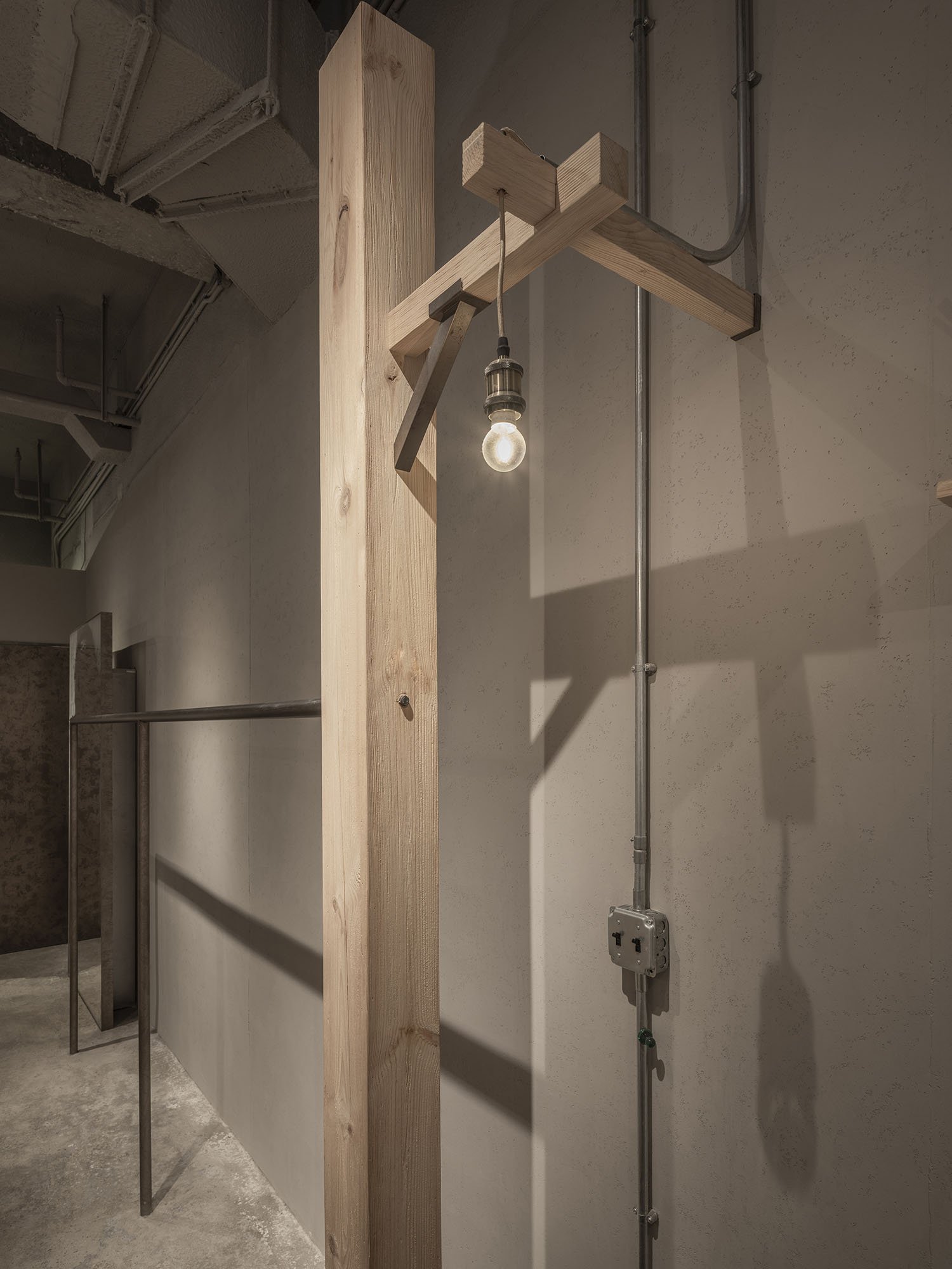
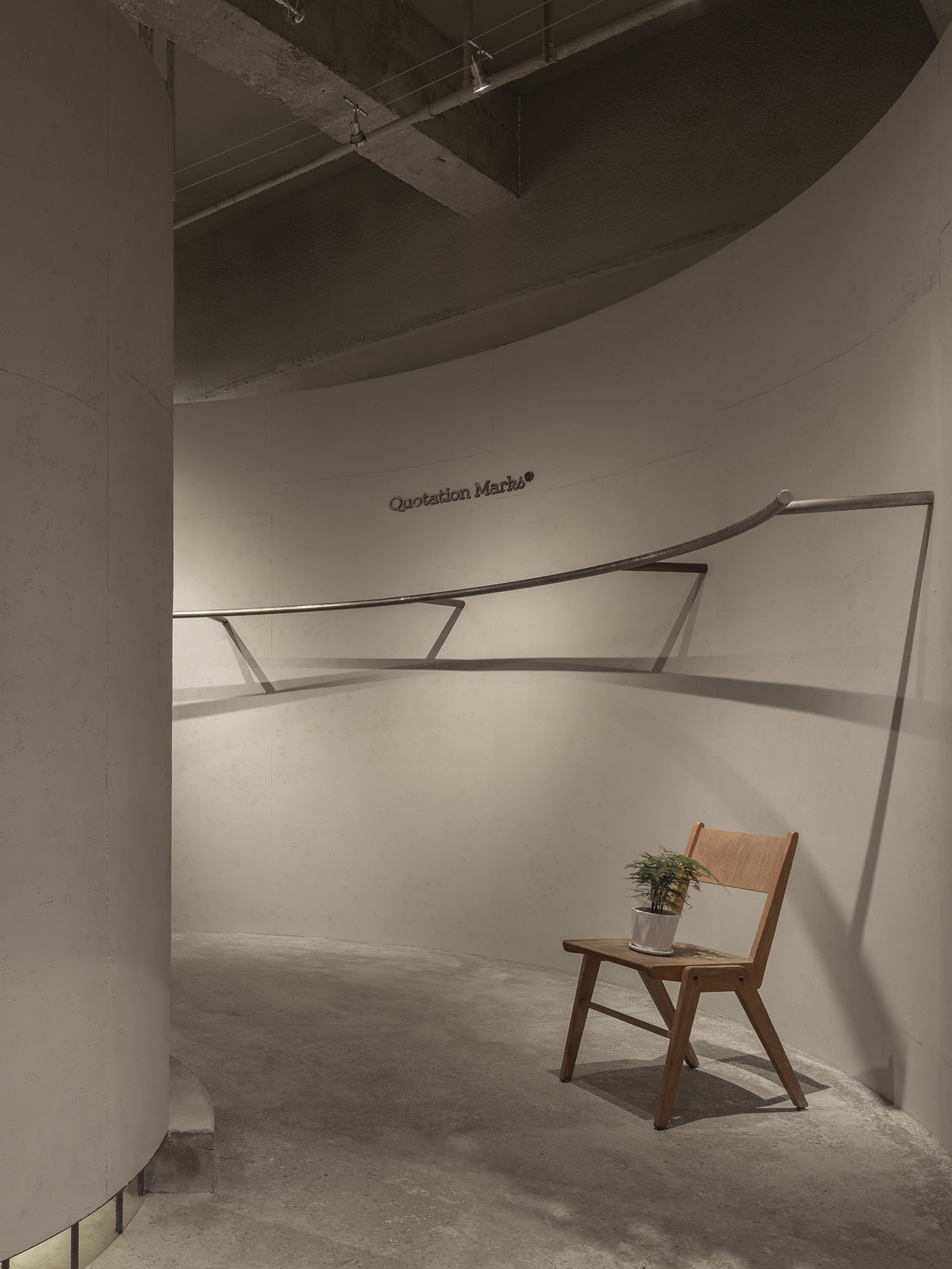
Every corner of the interior design embodies the spirit of craftsmanship. The manually crafted metal lines on the floor, the seemingly casual yet carefully designed structures on the walls, and the faint lights hidden above equipment pipes all demonstrate the utmost pursuit of detail.The mirror design in the store is also noteworthy, with brush marks removing some of the mercury around it, ingeniously incorporating a street-industrial roughness, offering a unique interpretation of ordinary mirrors.Each cement block, steel rod, and piece of wood in the building materials here tells the story of a brand embracing a simple, contemporary, and unadorned workwear style. The rugged industrial aesthetic, paired with avant-garde modern design, creates a space brimming with stories of creativity, craftsmanship, and emotion in every corner.