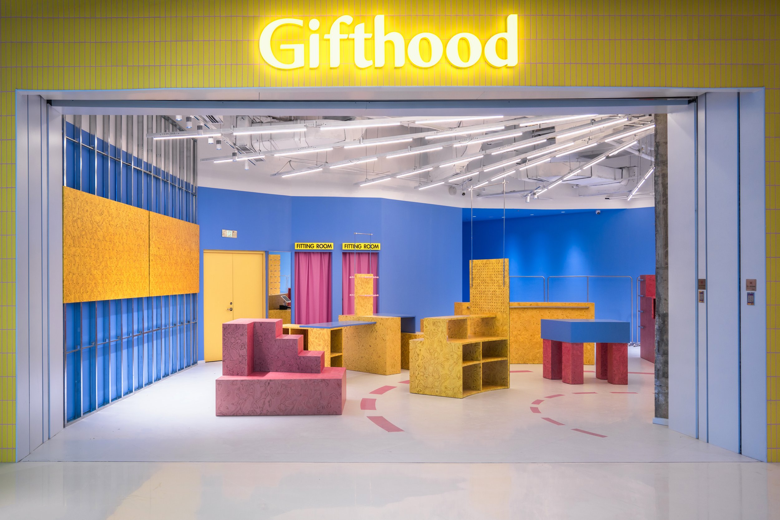
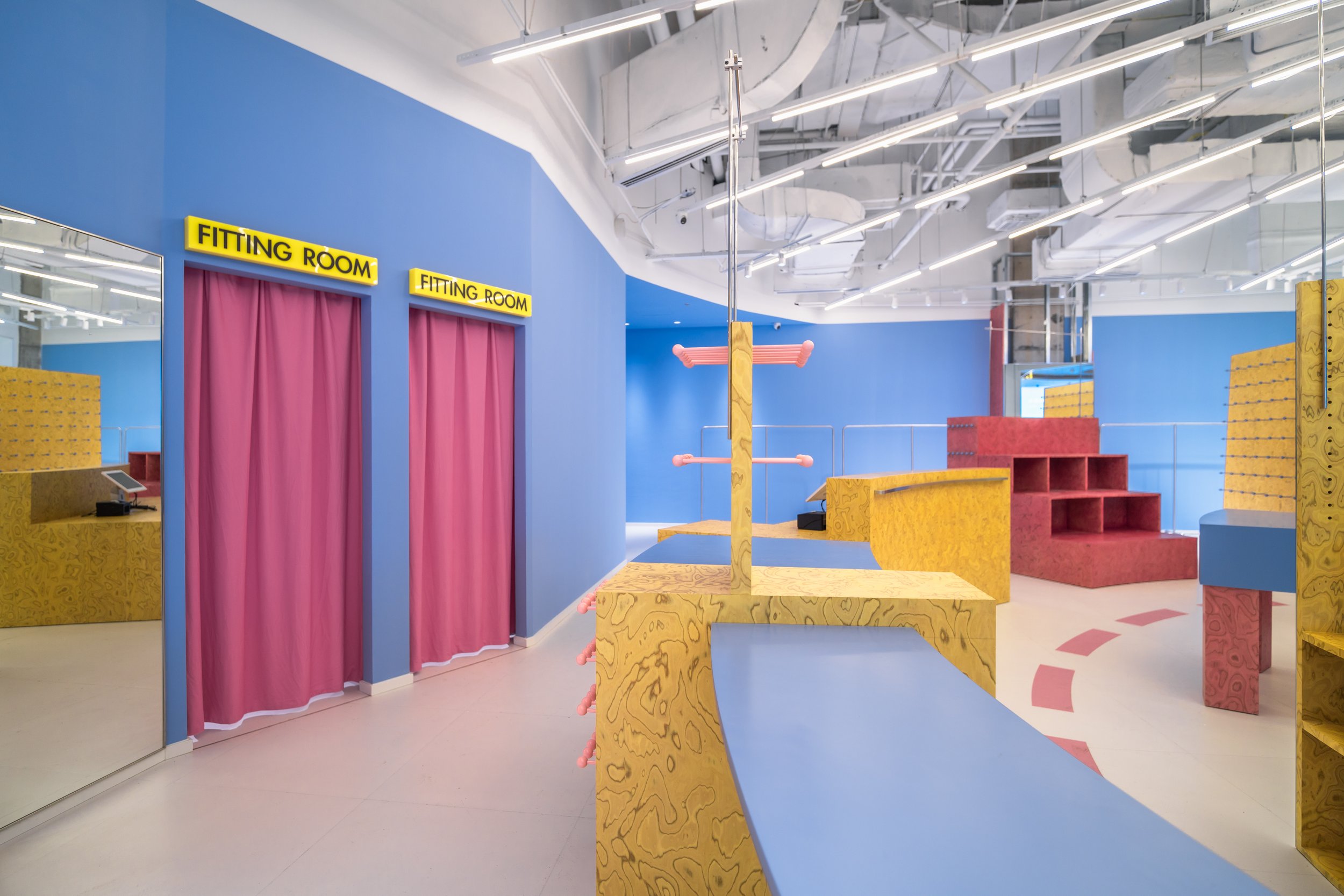
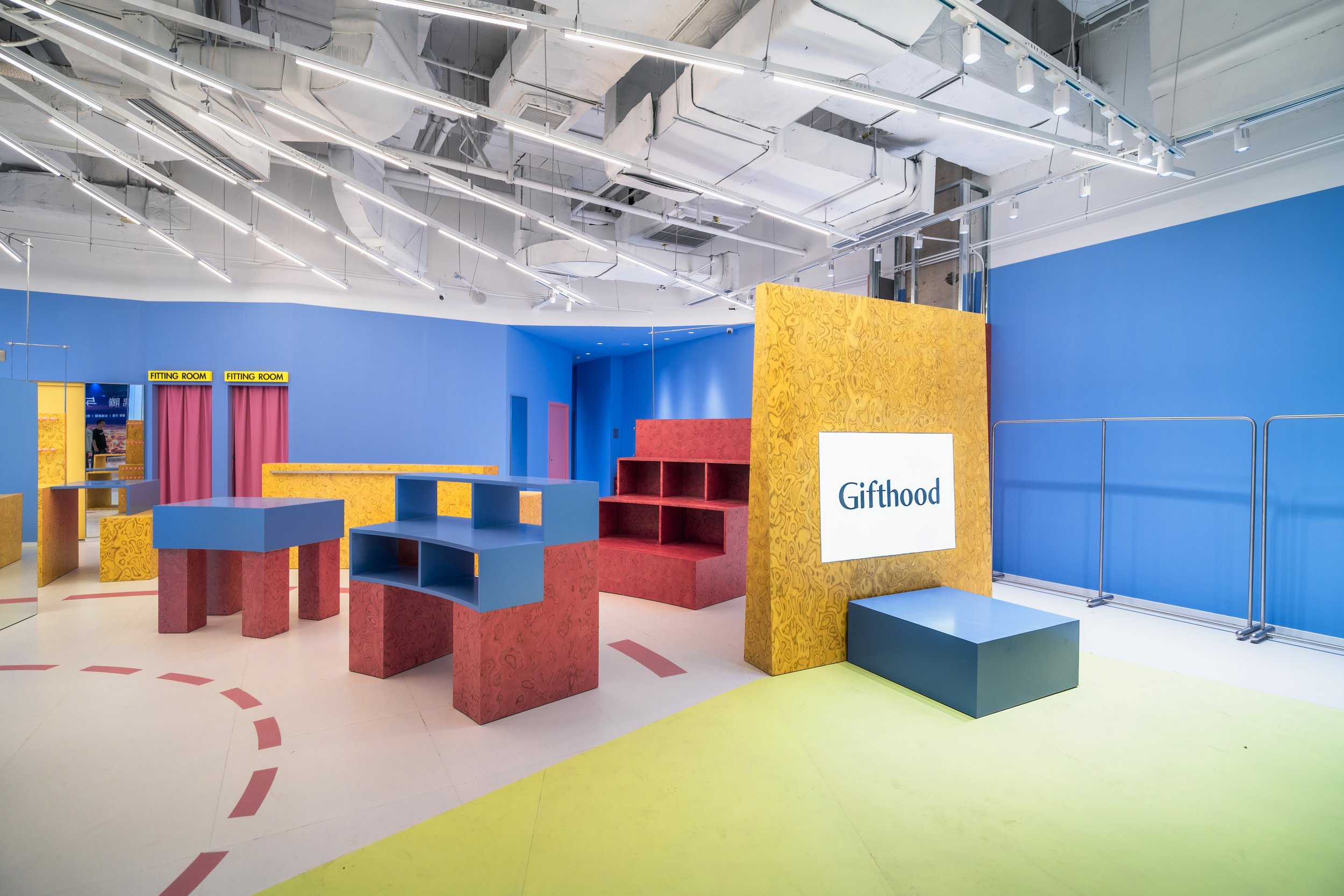
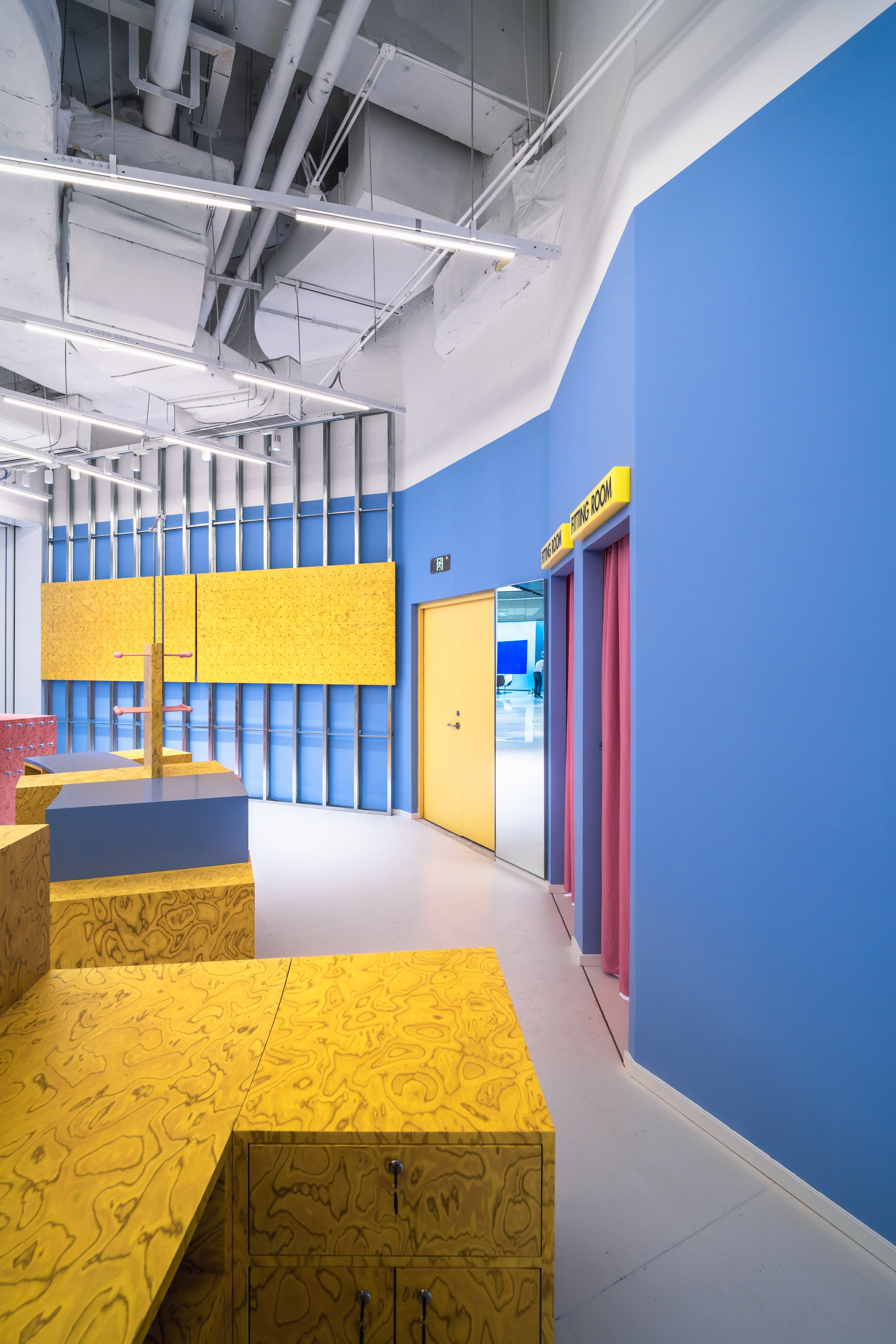
GIFTHOOD
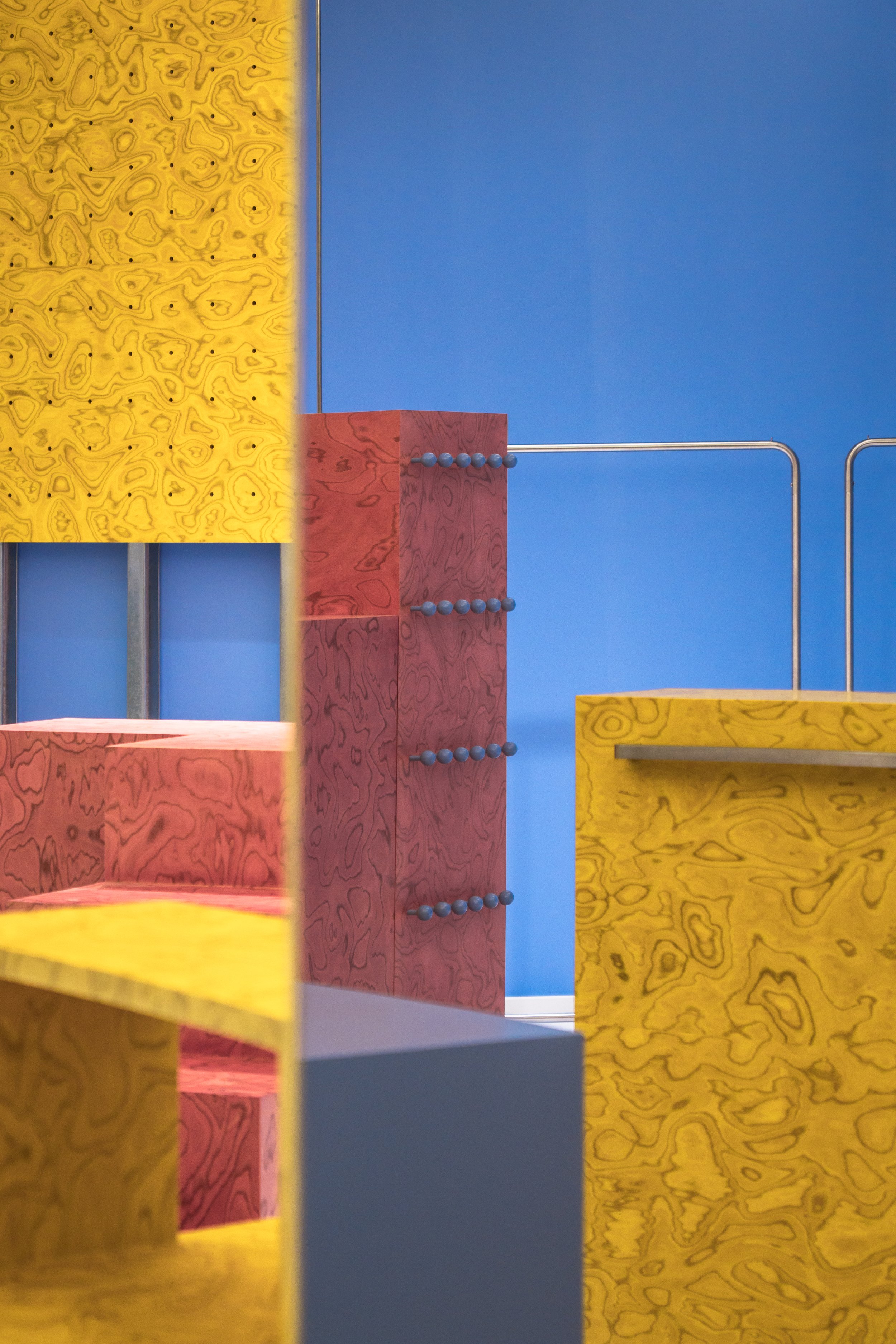
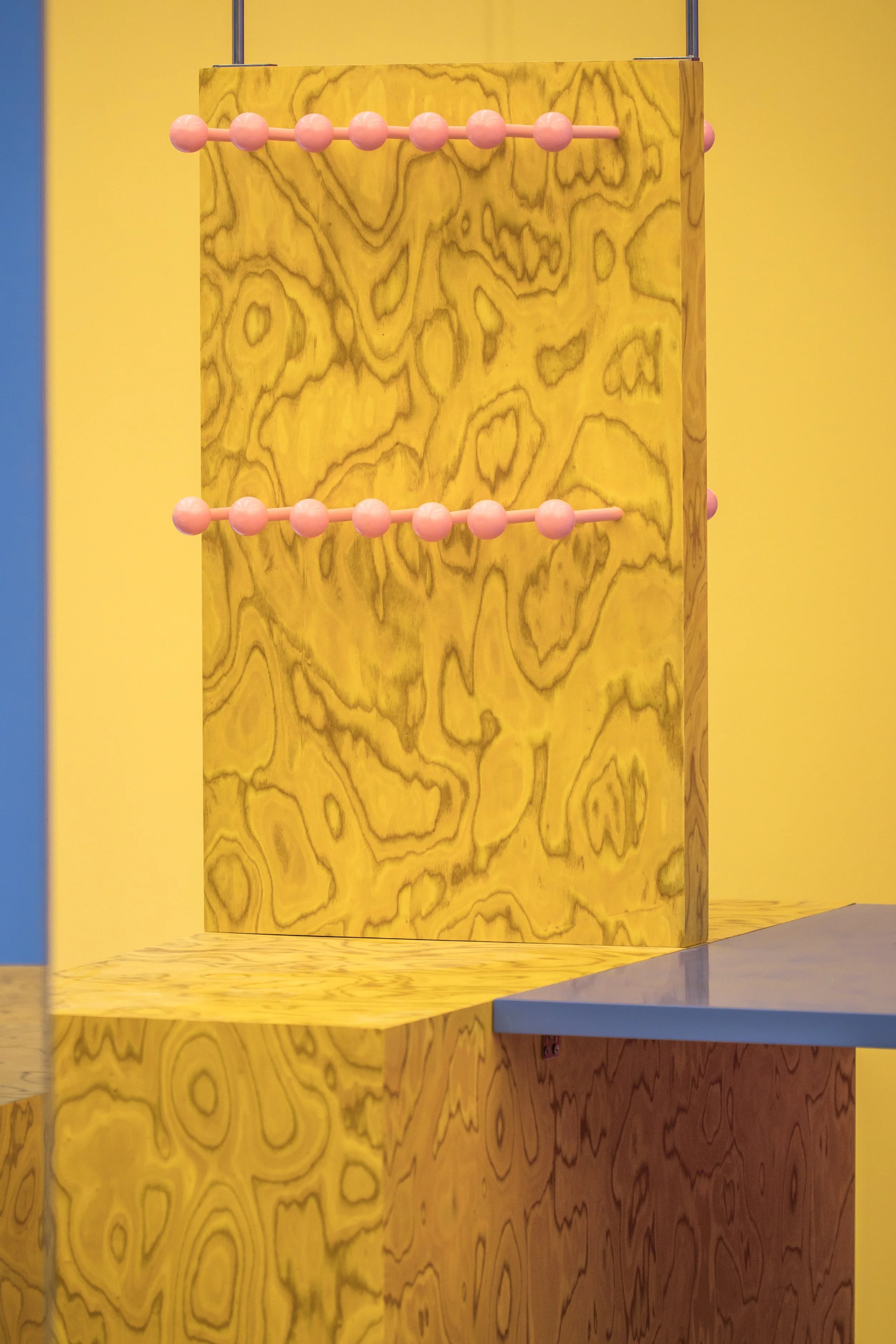
Bright yellow and blue serve as contrasting colors, with pink as an accent, creating a dopamine-inducing palette that evokes positive emotions and defines the space's primary expression.After organizing the storage area, the display naturally forms a fan shape. Fixtures radiate from the central architectural columns, aligning movement with the space's layout. The double storefront removes display windows, widening the entrance and creating an open, inviting atmosphere with solid-colored floors and minimalist furniture.Simple yet versatile display fixtures, resembling building blocks, reflect the brand's "gifts" concept, symbolizing how small gestures can foster deeper connections. 明亮的黄色与蓝色作为对比色,搭配粉色点缀,形成了一种激发多巴胺的色彩组合,唤起积极情绪,并定义了空间的主要表达。在整理完储物区后,展示区自然呈现出扇形布局。陈列装置从中央建筑立柱向外辐射,使动线与空间布局相契合。 双店面设计取消了展示橱窗,拓宽了入口,并通过纯色地板和简约家具营造出开放而温馨的氛围。简洁而多功能的展示装置,形似积木,呼应了品牌的“礼物”概念,象征着小小的举动可以建立更深层的联系。